The assembly project
Figma • Adobe Photoshop
A website designed to help users learn about bills, propositions, and current events affecting their local communities.

ROLE: (Solo project) UX Researcher, Product Designer • TIME: 1 month
THE PROBLEM
Despite the growing need for accessible and comprehensive information on legislative matters affecting our local communities, existing platforms are often outdated, limited in functionality, or designed for niche user groups. Several months before I started designing The Assembly Project, I was trying to locate a list of active bills affecting the region of Texas that I'm from (for an economics project I was working on). Not only was I having trouble finding such a list online—I was even struggling to locate a comprehensive, digestible list of every active bill in Texas. The official Texas Legislature website is incredibly dated and difficult to navigate. There is a critical need for modern, intuitive, and informative platforms that enable users to easily look up, learn about, and track local bills and legislative action.

THE SOLUTION
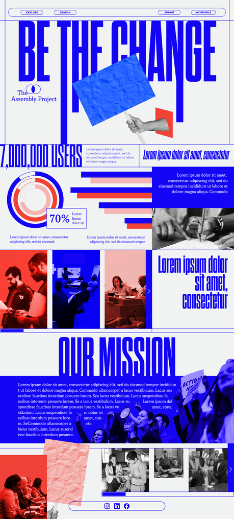
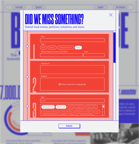
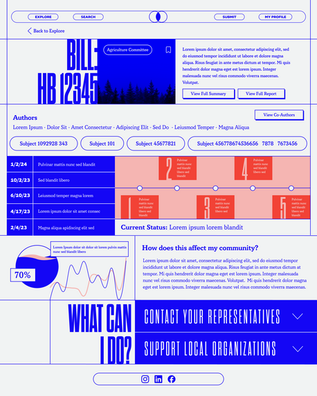
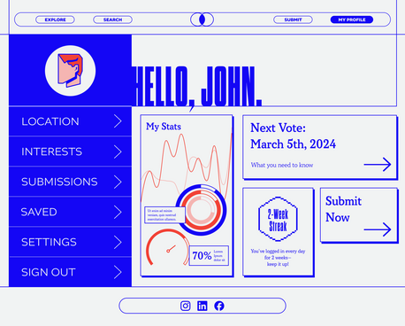
I designed a simple, visually engaging website that allows users to learn more about their local legislature and pertinent issues affecting their communities. After setting up a profile and inputting a residential address, users will receive tailored updates and notifications directly relevant to their location. This approach ensures that users can efficiently track and engage with local governance, fostering greater civic participation and informed decision-making.
TARGET AUDIENCE
This website would primarily target Millenials and Generation Z to encourage young voter turnout and combat misinformation spread on social media. However, it's designed to be inclusive and beneficial for users of all ages.
WIREFRAMES
INITIAL DESIGN
I had almost completed my high-fidelity design concepts for the homepage when I realized something was off. I wasn't satisfied with the mood of the site—I performed a couple of user interviews, and as I suspected, some of the descriptors that interviewees used included "playful," "fun," and "light-hearted." Although the site is geared toward a younger audience, I wanted it to be trendier, more professional, and, in turn, more empowering. So I went back to the drawing board!


HIGH-FIDELITY DESIGNS

CONCLUDING THOUGHTS
In conclusion, transforming a personal challenge into a practical case study has been incredibly rewarding. I really enjoyed the research process for this project, particularly learning more about the critical need for legislative transparency and voter education.
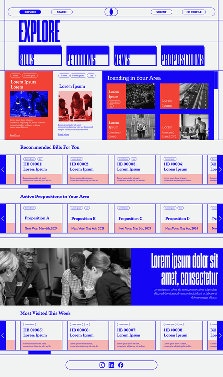
One key takeaway of mine has been learning to trust my design instincts—it was intimidating to backtrack when I was already deep into the design process, but I'm delighted that I made the decision to pivot. The final design aligns much better with my original vision than the first iteration. Looking ahead, if I were to revisit this project, I would create a section specifically dedicated to voter registration. I received feedback that there wasn't enough emphasis on voting resources. Additionally, I would aim to make the cards on the explore page more inviting.
.png)


